
Okay, well, it’s not really a crisis, even though it’s been driving me crazy for quite some time!
 When we first designed the old scsc web browsers were limited to a dozen or so “web safe fonts”, in order to make a web site logo that was not as plain as a 1950’s typewriter you had to use a graphics program and add the logo as an image file to the site. At one time we settled on the canteno font for our logo design, made it a very dark blue to it would not overly stand out, and life was good for the scsc “branding”. Years later lots of things for the web are changing.
Today most web browsers have the ability to “import” web fonts from other places around the web, and we are no longer stuck with old dozen web safe fonts as site designers and web surfers. There is a movement in the web design community to pull in “web fonts” and use them for displaying text instead of images, as there are certain benefits to doing things that way instead of using image files for fancy lettering.
Our site redesign in 2014 switched over to using web fonts for the logos to take advantage of the benefits of web fonts, replacing the old image files we once used before. As we started mixing things up with the themes and styles of the peeps section and the sex chat blog section we hit different little roadblocks with logo font design, and kind of just put one in place as we worked on the other styling components. It’s kind of embarrassing to admit that we have had three or four different logo styles showing up in different sections of the site for some time now.
Anyways, kicking around some different font style ideas for our new logo. Here are some of the ideas in a picture:
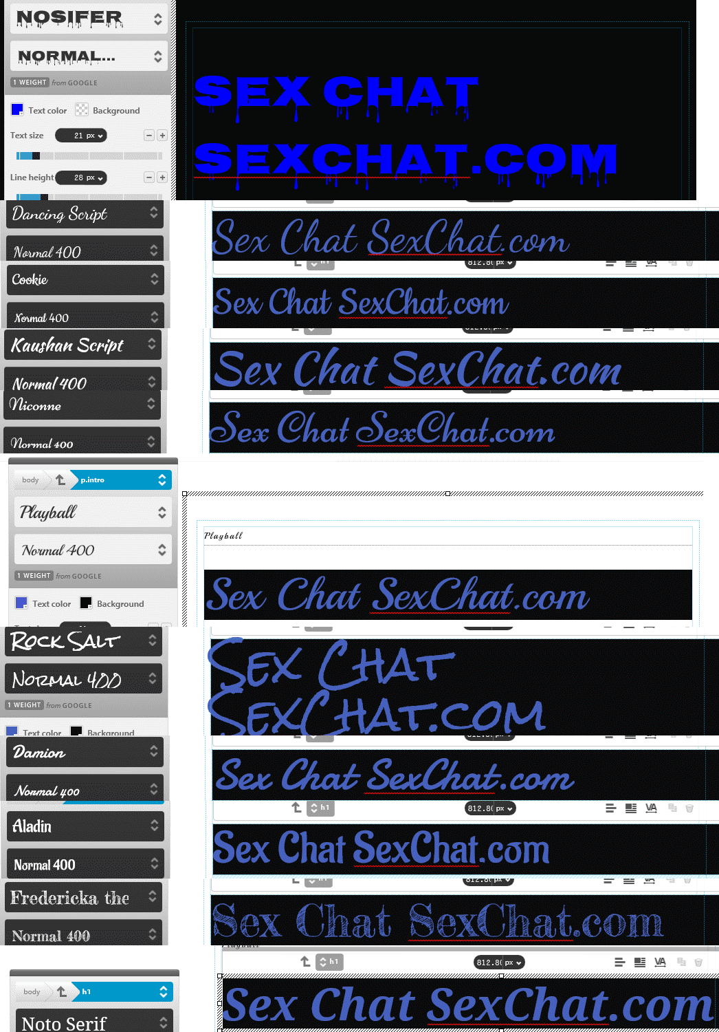
Looking around for fonts that I really like for our logo, a few that I found are not available to license as a web font yet, so I had to narrow down the options to some of “open web fonts” that are freely available. Going through some of the options at google fonts these are some that I think we should consider.
I chuckle at the nosifer font, as it could be construed to have a cum dripping, or squirt dripping effect. This one only has capitol letters, and is a little thick and overbearing I think. Some people may also consider the font to be gross for one reason or another, so probably going to axe this one from the ideas list.
As much as I think it’s important to put a lot of thought into a logo font, and it’s branding, I do not think that our logo needs to be overbearing. Really I’d like it to kind of fade into obscurity, be there when you look for it in the top left, but not stand out so much that it takes away from everything else that is important, and not stand out so much that someone on the other side of a cafe can easily read “Sex Chat SexChat” when someone comes to our site on a laptop.
I like the second font, the dancing script, but I think it may be a little too tall and stand out a bit more than what I am looking for.
The third one, the “cookie” font, is a nice script. This one may be in the top two choices. I am also leaning toward the “playball font”. These two I think are the closest to what I had in my mind from the limited choices. The others in the pic have something that are nice about them, but not quite perfect. None of these are totally awesome, but for what we are going for I think this list narrows it down. I will probably experiment with the cookie and playball to see how they align with the main sections of the site, the peeps are and the blog section.
 Of course like most things around here I appreciate any thoughts that others in the community have, so chime in if you think we should go in a different direction with the logo, or other fonts in general. Some have mentioned that the newer style of the blog section makes it easier to read, I am always interested in how others view the site and if things are easier to read or not so much. With so many devices out there, I can’t possibly recreate the viewing experience that everyone is having, but I keep my ears open for feedback and suggestions!
Using web fonts instead of picture files is supposed to make things appear better with small screens, and high resolution screens like retina devices (the newer iphones?) – and stuff like that. So hopefully we will come up with something that loads fast, and shows up well on everyone’s screens. I also hope that we find a font / logo identity that matches our fun and flirty ways, without standing out so much that it gets in the way.
This process has brought up some other finding with web fonts and privacy that I will put together in a separate post.